Today we continue looking at options to customize the SiteKiosk Windows Chrome Browser. In last month's post we learned how to easily swap images for the buttons of the browser tooolbar. This time we are going a bit more into the details and learn how to change colors for individual buttons.
Before we start I want to remind you, that there is an even simpler way to change the overall colors of the SiteKiosk Windows Chrome Browser. Just go to Start Page & Browser -> Chrome Browser -> Customize -> Browser Design in the SiteKiosk configuration editor. There you can find 5 color pickers for a quick custom adjustment.
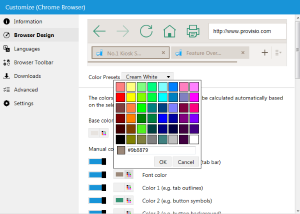
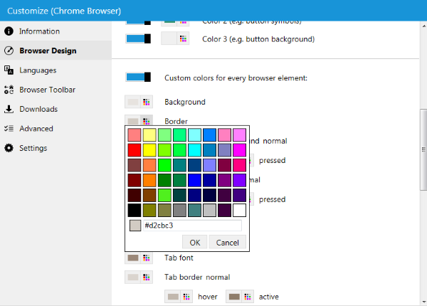
If you scroll down a little bit on that page, you can find an additional section that you can activate to create custom colors for every browser element.
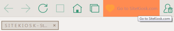
The customizing options provided by the configuration editor are already quite comprehensive. We will be going a step further and change the colors of just one button to make this button standout from the rest and attract the user's attention.
To do that, we need to open and edit a JSON (JavaScript Object Notation) file that is used by the Chrome Browser of SiteKiosk Windows. The file content.json is located in the folder C:\Users\Public\SiteKiosk\data\content\local\files\projects\d97aa96b962543fcb39625a3f8e8d8fb\000000000000000000000000. Open it with an editor like Notepad++.
For the purpose of this demonstration we will continue to edit the individual button that you can configure on the configuration page for the Chrome browser toolbar: Start Page & Browser -> Chrome Browser -> Customize -> Browser Toolbar. In the content.json file look for this line:
1 | "type": "content-custom-button-container",
|
This is the start of the definitions for the individual or custom button. A few lines down we can find a segment that looks like this:
1 2 3 4 5 6 7 8 9 10 11 | "icon": {
"src": "files/images/custom.svg",
"color": "[[$root.colors.toolbarButton.icon]]",
"hoverColor": "[[$root.colors.toolbarButton.iconHover]]",
"pressedColor": "[[$root.colors.toolbarButton.iconPressed]]"
},
"backgroundImage": {
"color": "[[$root.colors.toolbarButton.background]]",
"hoverColor": "[[$root.colors.toolbarButton.backgroundHover]]",
"pressedColor": "[[$root.colors.toolbarButton.backgroundPressed]]"
},
|
icon defines the image used for the button and the caption. src is the relative path to the image file so you can use your own image file without overwriting the existing one, color is the default color of the caption of the button, hoverColor is the color used when hovering the mouse over the button and pressedColor is used when the button is being clicked.
backgroundImage defines the colors for the background of the button. Again color is the default color of the caption, hoverColor is the color used when hovering the mouse of the button and pressedColor is used when the button is being clicked.
To assign your own color selection you can use the common notation format for colors: #FF9EDD.
Here is what an edited version of the above segment can look like:
1 2 3 4 5 6 7 8 9 10 11 | "icon": {
"src": "files/images/mycustom.svg",
"color": "#FF9EDD",
"hoverColor": "#BC7E87",
"pressedColor": "#AE0000"
},
"backgroundImage": {
"color": "#FFBE70",
"hoverColor": "#FF8B51",
"pressedColor": "#FF2600"
},
|
If you now prepare a configuration that includes an individual button you will get this result:
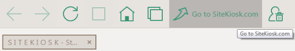
This is how the button looks by default:
Feel free to experiment with the values to create a custom browser experience that matches the needs of your kiosk project.